
Judge a design agency portfolio on four things: clients like you, work that follows UI and UX basics on the live site, a different look for each client rather than one house style, and the decisions behind each project. Pretty screenshots prove the least. If two portfolios look alike, ask each agency to walk you through one decision.
Why do most design portfolios tell you so little?
Because a portfolio is a highlight reel. Screenshots are cropped, concepts sit next to shipped work, and the team that did a project may have left. Most portfolios show what the work looked like, not why it looked that way, and the why is what you are buying.
In 2026 this matters more. AI tools let anyone produce polished screens quickly, so polish alone proves less than it did. What still separates agencies is judgment: what they decided to show first, what they left out, and why the look fits that one company. The six checks below test for judgment, and each one takes minutes.
Six checks for a design agency portfolio
| Check | How to run it | Red flag |
|---|---|---|
| 1. Clients like you | Count the projects for companies at your stage, selling to buyers like yours | Mostly consumer brands, restaurants or one-off concepts |
| 2. UI and UX basics | Open three live sites on your phone; check reading order, contrast, tap targets and load time | Work that only exists as screenshots, or breaks on a phone |
| 3. A different look per client | Cover the logos; can you tell the clients apart? | Every client shares one house style |
| 4. The decisions behind the work | Read the case studies for a problem, a choice and the reason | Only adjectives: clean, modern, bold |
| 5. Live and current | Visit the live sites and check they still match the portfolio | Concepts and redesigns that never launched, with no label |
| 6. Process you can see | Ask for a walkthrough or a behind-the-scenes of one project | No one can explain how a page was decided |
Why does niche matter in a portfolio?
A SaaS website sells a product, so the people designing it have to understand products: how buyers evaluate software, what proof a technical buyer wants, and how a pricing page is read. An agency whose portfolio is mostly consumer brands may make beautiful pages that answer the wrong questions.
Look for clients at your stage selling to buyers like yours. At Weroast we only design for SaaS and AI companies; we have designed for hiring, energy, data, healthcare billing and AI automation software. That is not a boast about range. It means that when we decide what goes on your first screen, we have made that decision for a similar buyer before.
How do you check that the work follows UI and UX basics?
Open the live sites, not the screenshots, and use them the way a buyer would. On a phone, read the first screen: is it clear what the company does? Scroll: does each section have one job, and is the proof easy to find? Check contrast and text size, tap the buttons, and see whether the page loads quickly. A portfolio that is beautiful in a frame and frustrating on a phone shows you what your site will be like.
Should every client in a portfolio look different?
Yes. Cover the logos and try to tell the clients apart. If you cannot, the agency has a house style, and your site will look like their other clients' sites, which is the opposite of what a brand is for.
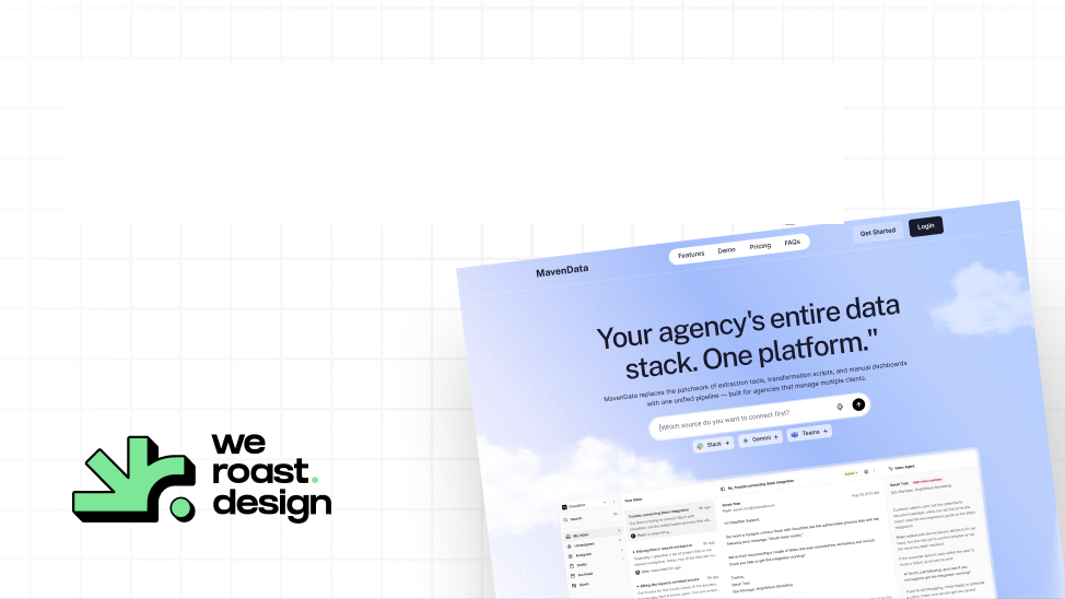
Our two most public projects make the point. Kuhnic, an AI automation company, runs dark and monochrome, with a whiteout lockup on near-black over a fine grid and outcome claims leading. Maven Data, a data pipeline for agencies, uses a blue-to-lavender gradient over a clean navy palette with generous whitespace. Each look came from that company's buyers and category. We call this a Signature Design Style: the look that makes people recognize the company before they read the logo.
How do you read the decisions behind the work?
A useful case study states the problem, the decision and the reason. "Clean and modern" is not a decision. "The category is loud and the claims are identical, so we let the proof be the loudest thing on the page" is.
The best test is to watch a decision being made. Few agencies publish their process, so ask for a walkthrough of one project: what options were considered for the homepage's first screen, which was chosen, and why. We publish ours: the Kuhnic behind-the-scenes video shows the direction being decided.
What do you ask when two portfolios look equally good?
Stop comparing screenshots and compare thinking. Ask each agency the same five questions, and judge the answers on how specific they are.
- Walk us through one project: what did you decide for the first screen, and what did you reject?
- Which projects in this portfolio were designed by the people who would work on ours?
- Which of these sites are live today as you designed them?
- What would you do differently on our site than on your closest past client's?
- What will you need from us, and what will you push back on?
Who is Weroast?
Weroast is a design partner built only for post-PMF B2B SaaS and AI companies, from Seed to Series B. Product, website, brand and motion designers work as one team. As of November 2026, the Signature Homepage is $9,783 and takes nine days, and the Scalable Website System is $22,981 and takes 3.5 weeks. See pricing and our work.
We are listed as a trusted design partner by Fletch, a product marketing firm. We do not do positioning ourselves; we work alongside partners such as Fletch.
Hire Weroast only if
- You want a look that is only yours, not an agency's house style.
- You want to see how decisions are made before you sign.
- Your positioning is clear, or you have a partner for it. We do not do positioning.
- You are a B2B SaaS or AI company past product-market fit, from Seed to Series B.
FAQ
Can’t find your answer?
Book a call and let’s talk
Clients like you, work that follows UI and UX basics on the live site, a different look for each client, and case studies that explain the decisions behind the work. Polished screenshots alone prove the least.
Ask each to walk you through one decision on one project: the options, the choice and the reason. Ask which projects were done by the people who would work on yours, and which sites are live today as designed.
For a brand or website project, yes. A shared house style means your site will look like their other clients'. Each client's look should come from its own buyers and category.
It helps. An agency that works with software companies already knows how buyers evaluate software and what proof they need, so it spends less time learning your world and more time on the decisions.
AI is a normal part of design work in 2026. What matters is whether the decisions are the agency's own and whether the work is live and holds up on a phone. Ask how a page was decided, not which tools made it.
Need help deciding what to build first?
Book a sprint call and we will map the right scope for your launch stage.
Book a call