
An AI SaaS website has a harder job than most: buyers have learned to discount AI claims, and most AI sites look alike. A redesign that works leads with outcomes buyers can check, shows the product working, and looks like no other company in the category. Weroast redesigns AI SaaS homepages in nine days for $9,783.
Why is an AI company's website harder to get right?
Three reasons. First, the claims all sound the same: transformation, copilots, agents, ten times faster. Buyers have heard them all and discount every one. Second, the products are hard to show. An agent or a model working in the background does not screenshot well, so many sites fall back on abstract gradients and glowing orbs. Third, the look has converged. In our view, AI tools trained on existing sites reproduce the category's usual look, so AI companies building their sites with AI tools end up looking like each other.
The result is a category where a competent website is invisible. The redesign has to do the opposite of what the category does.
What should an AI SaaS website lead with?
- An outcome a buyer can check, stated plainly: what changes, for whom, and by how much, rather than what the model is.
- The product working: real screens, real outputs, or a short motion piece that shows the agent doing the task, start to finish.
- Proof in the first scroll: named customers, integrations, and the platform your buyers already use.
- How it handles risk: data, security, accuracy and where a person stays in control, because AI buyers ask early.
- A next step that says what the buyer will see, not just "book a demo".
What did this look like for Kuhnic?
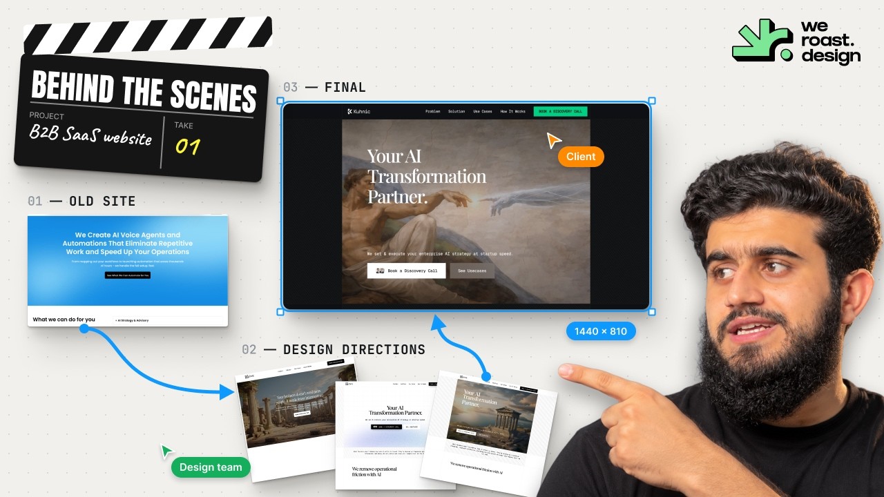
Kuhnic sells enterprise AI strategy, automations and voice agents. Every second company in its category calls itself an AI transformation partner; the claims are identical and buyers discount them. Kuhnic's real difference is that it ships, so the design problem was saying that credibly.
We worked with Jorge on the website's design and structure, and landed on a dark, technical system where outcome claims lead: more clients without adding staff, weeks of due diligence down to an hour. The brand runs monochrome, with the whiteout Kuhnic lockup on near-black over a fine grid, which keeps the proof, the client logos and the platform diagrams the loudest things on the page. Read the Kuhnic case study, and watch the direction being decided in the behind-the-scenes video.
How do you avoid the AI template look?
Start from what is true only of you: your buyers, your product's actual output, and the proof you can show. Then decide a visual direction that comes from that, and check it against the category: if a competitor could swap in their logo, it is not finished. We call the result a Signature Design Style, the look that makes people recognize your company before they read the logo.
AI is still in the workflow. We use it heavily to execute once the direction is decided. It just does not decide the direction. We cover why in AI-built vs designed website.
What does an AI SaaS website redesign cost?
- Signature Homepage: $9,783, nine days, with motion graphics and custom development included.
- Scalable Website System: $22,981, 3.5 weeks, a homepage plus five pages and a design system built for Claude, Cursor and Codex, with a guide and video so your team ships new pages after we finish.
- Website, product and brand together: a design pod from $35,000, scoped on a call.
Who is Weroast?
Weroast is a design partner built only for post-PMF B2B SaaS and AI companies, from Seed to Series B. Product, website, brand and motion designers work as one team, so the people designing your site understand the product behind it. Maven Data's homepage was designed in one week (case study). See pricing and who we serve.
We are listed as a trusted design partner by Fletch, a product marketing firm. We do not do positioning ourselves; we work alongside partners such as Fletch, because positioning shapes design.
Hire Weroast only if
- You are an AI or B2B SaaS company past product-market fit, from Seed to Series B.
- Your site looks like the rest of your category, and that is costing you attention or trust.
- Your positioning is clear, or you have a partner for it. We do not do positioning.
FAQ
Can’t find your answer?
Book a call and let’s talk
An outcome buyers can check on the first screen, the product shown working, proof such as customers and integrations early, a clear answer on data and accuracy, and a look that belongs to one company rather than the category.
In our view, because many are built from the same templates and AI tools, which reproduce the category's usual look: dark gradients, glowing shapes and similar claims. A distinct direction has to be decided by people who know the buyer.
At Weroast, a homepage takes nine days and a homepage plus five pages with a design system takes 3.5 weeks, both with development included, once positioning is settled.
Show the input and the output: what goes in, what the agent does, and what comes back, with real examples. Short product motion often explains an agent better than a static screenshot.
Yes. Kuhnic, an AI automation company, is a published case study, and the full design process is public in our Kuhnic behind-the-scenes video.
Need help deciding what to build first?
Book a sprint call and we will map the right scope for your launch stage.
Book a call