
A B2B SaaS website holds back pipeline when buyers leave unsure what you do, judge you smaller than you are, or doubt your price before a call. Great design cannot fix unclear positioning, and the wrong design can damage clear positioning. Check seven signs, each testable this week, before you redesign anything.
How does a website hold back pipeline?
Quietly. A B2B buyer rarely complains about your website; they just do not book the call, or they book it already discounting you. The site's job is to move a buyer through four stages: attention, engagement, evaluation and conversion. In our view, pipeline leaks at whichever stage the site gets wrong, and each leak has a different cause.
The seven signs below are the ones we see most when SaaS teams come to us. Three are about what the site says, three are about what the design says, and one is about the next step. For each, there is a way to check it with data you already have.
Sign 1: buyers cannot say what you do after the first screen
This is a positioning problem first, and design cannot fix it. A beautiful site around an unclear message makes the message look expensive and stay unclear. Check it this week: show your homepage's first screen to five people who fit your buyer profile for ten seconds, then ask what the company does and who it is for. If the answers differ, settle positioning before any redesign. We do not do positioning; we work alongside partners such as Fletch, and the three litmus tests are a good first check.
Sign 2: sales spends the first call re-explaining the product
If the first ten minutes of every discovery call correct what the website implied, the site is doing negative work. Listen to five recent call recordings and note every "actually, we also" or "no, we are not". Those corrections are the sections your site is missing or getting wrong.
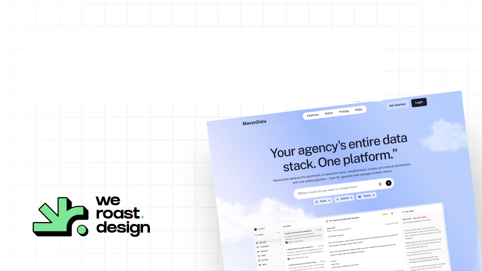
Maven Data's product does three jobs: extraction, a metrics layer and client dashboards. A site that explained all three at once would read like an infrastructure diagram. So the Maven Data site gives each job its own pass, prices are tiered against them, and the demo button commits to what twenty minutes will show: one real source connected and one working dashboard before the call ends.
Sign 3: the design sends the wrong message about who you are
Buyers read the look before the words. A site that looks like a weekend project gets treated like one, even when the product is serious, and a site that looks like every competitor's gets lumped in with them. Check it by asking a prospect who has not seen your product what kind of company the site suggests: how big, how established, and how it compares with the companies they already use. If the answer is smaller or vaguer than the truth, the design is costing you trust before evaluation starts.
Sign 4: your price is higher than your site looks
Design sets price expectations before a buyer sees a number. If you charge enterprise prices from a site that looks early-stage, every sales call starts with a price objection, because the site framed you as the cheaper option. Check your deal notes: if discount requests and "we expected less" come up early and often, the design is undercutting your price framing. Raising the design to match the price is usually cheaper than discounting every deal.
Sign 5: your proof is buried
Buyers in evaluation want proof: customer names, outcomes, the product itself, and the price model. If those sit below six sections of claims, most buyers never reach them. Check your scroll data in a tool such as Microsoft Clarity or GA4: where does half your homepage traffic stop scrolling, and what proof is above that line? When Kuhnic needed to stand out in a loud AI category, the outcome claims came first and the proof, client logos and platform diagrams became the loudest things on the page.
Sign 6: the site, product and decks look like three companies
When the website, the product UI and the sales deck each look different, buyers notice the seams during evaluation, exactly when they are judging whether you are reliable. Put a screenshot of each side by side. If you cannot tell they are the same company without the logo, the brand system is missing, and a website redesign alone will add a fourth look. That is a brand refresh; see brand refresh vs rebrand vs website redesign.
Sign 7: the next step asks too much, too soon
A single "Book a demo" button that leads to a long form asks a cold visitor for a commitment they are not ready for. Check your analytics: compare visits to your demo page with demo requests. If many arrive and few submit, the step is too big or too vague. Say what the call will show, as Maven Data's does, and offer a smaller step for buyers who are still evaluating, such as pricing or a product tour.
Which signs does a redesign fix?
Signs 3 to 7 are design problems, and a redesign fixes them. Sign 2 is part message and part structure, so a redesign helps if the message is right. Sign 1 is positioning, and a redesign makes it worse, because it spends money making an unclear message look finished. Fix it first.
If the signs point to design, a homepage sprint is the fastest test: our Signature Homepage is $9,783 and takes nine days, developed and launch-ready. If several pages leak, the Scalable Website System is $22,981 for a homepage plus five pages in 3.5 weeks. See pricing, and when to redesign a SaaS website for the timing question.
Who is Weroast?
Weroast is a design partner built only for post-PMF B2B SaaS and AI companies, from Seed to Series B. Product, website, brand and motion designers work as one team, so the site is designed by people who understand the product it sells. You can watch how we make these decisions in the Kuhnic behind-the-scenes video.
We are listed as a trusted design partner by Fletch, a product marketing firm. We do not do positioning ourselves; we work alongside partners such as Fletch.
Hire Weroast only if
- Your positioning is clear, and the signs point to design, not message.
- You want a site that looks like only your company and frames your price correctly.
- You are a B2B SaaS or AI company past product-market fit, from Seed to Series B.
FAQ
Can’t find your answer?
Book a call and let’s talk
The common causes are an unclear message on the first screen, design that makes the company look smaller or more generic than it is, proof buried below the fold, a site that looks different from the product and decks, and a next step that asks too much. Check each with call recordings, scroll data and a five-person first-screen test.
In our experience, they leave when they cannot see how the product works or what it connects to, when proof is vague, or when the next step is a sales call with no clear payoff. Show the product, name the integrations, and say what a call will show.
No. A redesign makes an unclear message look finished, which makes it harder to fix later. Settle positioning first. Weroast works alongside partners such as Fletch for positioning.
Buyers form a price expectation from the look before they see a number. A site that looks early-stage frames you as the cheaper option, so a premium price feels like a surprise and invites discount requests.
Use data you have: call recordings for repeated corrections, scroll data for where buyers stop, demo page visits against demo requests, and deal notes for early price objections. If these point to the site, test a homepage redesign first.
Need help deciding what to build first?
Book a sprint call and we will map the right scope for your launch stage.
Book a call