
Judge a design decision by the job it was given, not by whether you like it. Ask what the section must make the buyer believe, what options were considered, why this one, and what proof it uses. Good feedback names the job that is not being done. Taste feedback, such as make it pop, slows projects and rarely improves them.
Why is design hard to judge?
Because everyone has taste, and taste feels like judgment. A founder who dislikes green will see a green page as wrong, even if green is the right choice for the buyer. Most design reviews go wrong this way: comments about preference, rounds of changes, and a final page that pleases the room and does less for the buyer.
The fix is to judge each decision against its job. In our view, every element of a SaaS website has a job in one of four stages of a visit: attention, engagement, evaluation and conversion. If you know the job, you can judge the decision without knowing anything about type or color.
Five questions to judge any design decision
- What is this for? Which stage of the visit, and what should the buyer believe after seeing it?
- What else was considered? A decision with no alternatives was not a decision.
- Why this option? The reason should be about the buyer, the product or the category, not about the designer's preference.
- What proves it? Claims need proof nearby: a customer, a number, the product itself.
- Could a competitor use it? If the section works with their logo on it, it does not yet belong to you.
What does useful design feedback sound like?
It names the job that is not being done. Compare "I don't like the hero" with "after the first screen, I still can't tell this is for finance teams". The first starts a guessing game; the second gives the designer a problem to solve, and they may solve it with copy, structure or imagery rather than a new color.
- Say what the buyer would think or do, not what you prefer.
- Point to the stage: attention, engagement, evaluation or conversion.
- Separate facts from opinions: "this customer logo is not approved" is a fact; "the gradient feels heavy" is an opinion, so say why it matters.
- Give all feedback in one round, from one person, so the designer is not balancing competing voices.
What are the red flags in a design review?
- The designer cannot say what a section is for.
- Every option shown looks like a competitor's site.
- Decisions are defended with trends rather than with your buyers.
- The proof is decorative: stock photos, vague logos, numbers without context.
- The room is voting on colors before anyone has agreed on what the page must say.
What does a well-argued decision look like?
Kuhnic sells AI automation in a category where every second company calls itself an AI transformation partner. The claims are identical and buyers discount them. The decision: run the site dark and monochrome, let outcome claims lead, such as weeks of due diligence down to an hour, and make the proof, client logos and platform diagrams the loudest things on the page.
Run the five questions on it. What is it for: attention and evaluation, in a category buyers distrust. What else was considered: the category's usual look, which was the problem. Why this option: it stands apart and puts proof first. What proves it: real outcomes and client logos. Could a competitor use it: not without the proof. You can watch this decision being made in the Kuhnic behind-the-scenes video and see the result in the case study.
How should a design partner present decisions?
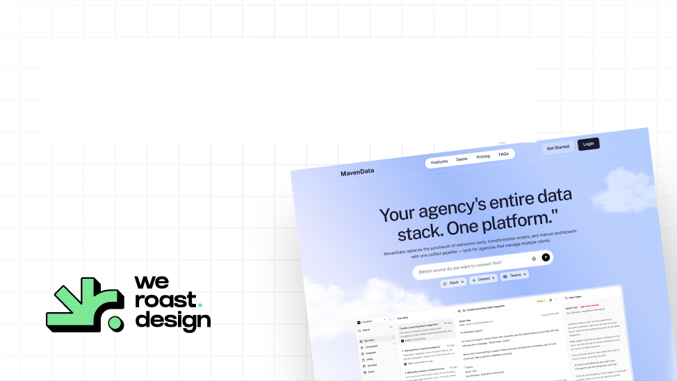
With the job, the options and the reason, before the visuals. If a partner only shows finished screens, ask for the reasoning; if they cannot give it, the decisions were not made. We show ours: every Weroast project starts with a strategy call that agrees the direction, and we show the behind-the-scenes of past projects on the first call so you can judge how we decide before you hire. Maven Data's homepage was designed in one week this way, with each decision checked against its job.
Who is Weroast?
Weroast is a design partner built only for post-PMF B2B SaaS and AI companies, from Seed to Series B. The Signature Homepage is $9,783 and takes nine days; the Scalable Website System is $22,981 and takes 3.5 weeks. See pricing.
We are listed as a trusted design partner by Fletch, a product marketing firm. We do not do positioning ourselves; we work alongside partners such as Fletch, because the job of each section comes from positioning.
Hire Weroast only if
- You want to see the reason behind every decision, not only the result.
- One person on your side can give feedback in one round.
- You are a B2B SaaS or AI company past product-market fit, from Seed to Series B.
FAQ
Can’t find your answer?
Book a call and let’s talk
Say what the buyer would think or do at that point, and which job the section is not doing. Avoid preference comments; give all feedback in one round from one person.
Check each part against its job: does the first screen make the right buyer stay, does the scroll answer their questions in order, is the proof real and early, and is the next step clear? And could a competitor use it with their logo?
What each section is for, which options were considered, why this one was chosen, and what proof it uses. A designer who can only describe how it looks has not explained the decision.
One person, usually the head of marketing or the founder, who collects input from others before giving one round of feedback.
Need help deciding what to build first?
Book a sprint call and we will map the right scope for your launch stage.
Book a call