
A SaaS homepage redesign succeeds when the message is settled before design starts, each section has one job in the buyer's path from attention to a booked call, proof comes early, and the page is checked on a phone before launch. Use these 30 checks, grouped into before, during and after, each one testable.
Before kickoff: is the message ready? (6 checks)
- 1. You can say what the company does and for whom in one sentence, and five people on the team say the same sentence.
- 2. The buyer is named: the role that signs and the role that uses.
- 3. You know the three things a buyer must believe to book a call, and you have proof for each.
- 4. One person approves the design.
- 5. Real inputs exist: current product screenshots, customer logos you may show, and quotes you may use.
- 6. You know what is wrong with the current homepage, from data: call notes, scroll depth, demo requests, lost deals.
Attention: the first screen (6 checks)
- 7. The headline says what the product does, not what the company believes.
- 8. The subhead names who it is for and the outcome they get.
- 9. The first screen looks like only your company. Cover the logo: could a competitor use it?
- 10. One primary action, and it says what happens next.
- 11. Something real is visible: the product, an output, or a customer.
- 12. It loads fast on a phone, and the first screen makes sense without scrolling.
Engagement: the scroll (5 checks)
- 13. Every section has one job, and you can name it in four words.
- 14. Sections follow the order of a buyer's questions: what is it, does it work, for whom, what does it cost, what next.
- 15. A product with several jobs gives each job its own pass, instead of one crowded diagram.
- 16. Motion explains the product; it does not decorate.
- 17. Headings can be read alone and still tell the story.
Evaluation: proof and price (6 checks)
- 18. Named customers or logos appear in the first two scrolls.
- 19. At least one outcome with a number or a before and after.
- 20. The product is shown as it really is, so the demo matches the page.
- 21. Integrations and the tools your buyers already use are named.
- 22. Pricing or the pricing model is one click away.
- 23. Security, data and compliance answers are easy to find if your buyers ask.
Conversion: the next step (3 checks)
- 24. The main call to action says what the buyer will get, for example what a demo will show.
- 25. A smaller step exists for buyers still evaluating, such as pricing or a product tour.
- 26. The form asks only what sales needs for the first call.
Before and after launch (4 checks)
- 27. Checked on a real phone and a real laptop, not only in the design file.
- 28. Redirects, titles, descriptions and structured data carried over, so search rankings survive the change.
- 29. Analytics events for the main actions work before launch, so you can compare before and after.
- 30. A date four to six weeks after launch to compare demo requests, scroll depth and sales-call notes with the old page.
What do these checks look like on a real homepage?
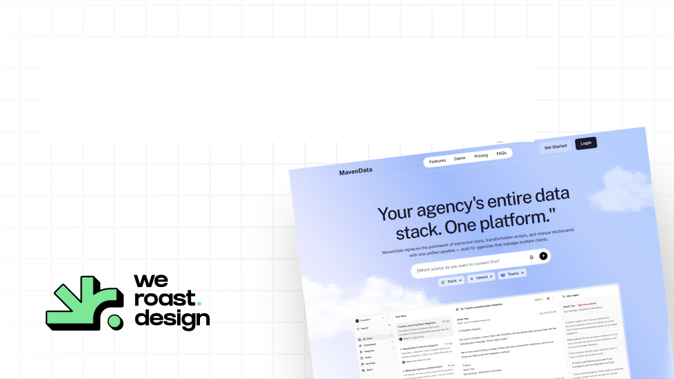
Check 15 and check 24 came from Maven Data. The product does three jobs, extraction, a metrics layer and client dashboards, so each got its own pass instead of one diagram, and the demo button commits to what twenty minutes will show: one real source connected and one working dashboard before the call ends. That homepage was designed in one week.
Check 9 and check 18 came from Kuhnic. In a category where every AI company makes the same claims, the outcome claims lead and the proof, client logos and platform diagrams are the loudest things on the page, in a dark monochrome look no competitor shares. You can watch those decisions in the Kuhnic behind-the-scenes video.
Who is Weroast?
Weroast is a design partner built only for post-PMF B2B SaaS and AI companies, from Seed to Series B. Our Signature Homepage runs this checklist in nine days for $9,783, with motion graphics and custom development included. The Scalable Website System extends it to five more pages and a design system in 3.5 weeks for $22,981. See pricing and homepage design for SaaS.
We are listed as a trusted design partner by Fletch, a product marketing firm. Checks 1 to 3 are positioning; we do not do positioning ourselves, and work alongside partners such as Fletch.
Hire Weroast only if
- Checks 1 to 6 pass, or you have a partner working on them.
- You want a homepage that looks like only your company, developed and launch-ready.
- You are a B2B SaaS or AI company past product-market fit, from Seed to Series B.
FAQ
Can’t find your answer?
Book a call and let’s talk
A headline that says what the product does, who it is for, the product shown working, named customers and an outcome early, the pricing model one click away, and a next step that says what the buyer will get.
Settle the message, name the buyer, list what the buyer must believe and your proof for each, pick one approver, gather real screenshots and logos, and write down what is wrong with the current page using data.
Keep or redirect every URL, carry over titles, descriptions and structured data, keep the main topics on the page, and check search performance in the weeks after launch.
Set up analytics events before launch, then compare demo requests, scroll depth and sales-call notes four to six weeks after launch with the old page.
At Weroast, nine days for design and development once the message is settled. See how long a website redesign takes.
Need help deciding what to build first?
Book a sprint call and we will map the right scope for your launch stage.
Book a call